The assignment for this module called to explore a set of provided vectors:
"Create a side-by-side boxplot (boxplot(x, ...)) and and histogram ((hist(x, ...))
Discuss the outcome of your results regarding patients BPs & MD’s Ratings.
Post your result in your blog and code on GitHub."
  1.    "0.6","103","bad","low","low”
  2.     "0.3","87","bad","low","high”
  3.     "0.4","32","bad","high","low”
  4.      "0.4","42","bad","high","high"
  5.     "0.2","59","good","low","low”
  6.      "0.6","109","good","low","high”
  7.     "0.3","78","good","high","low”
  8.      "0.4","205","good","high","high”
  9.      "0.9","135",”NA","high","high"
  10.    "0.2","176",”bad","high","high”
This data intially gave me some roadblocks, as I was unable to properly boxplot the "First", "Second", and "Final" columns of categorical data. To get around this, I stuck to the internal 'boxplot' and 'hist' functions like provided in the instructions, and converted the categories to numerical representations by creating 2 custom functions and using 'sapply' over the vectors before creating the dataframe.
At this point, I was able to produce the boxplots and histograms below.
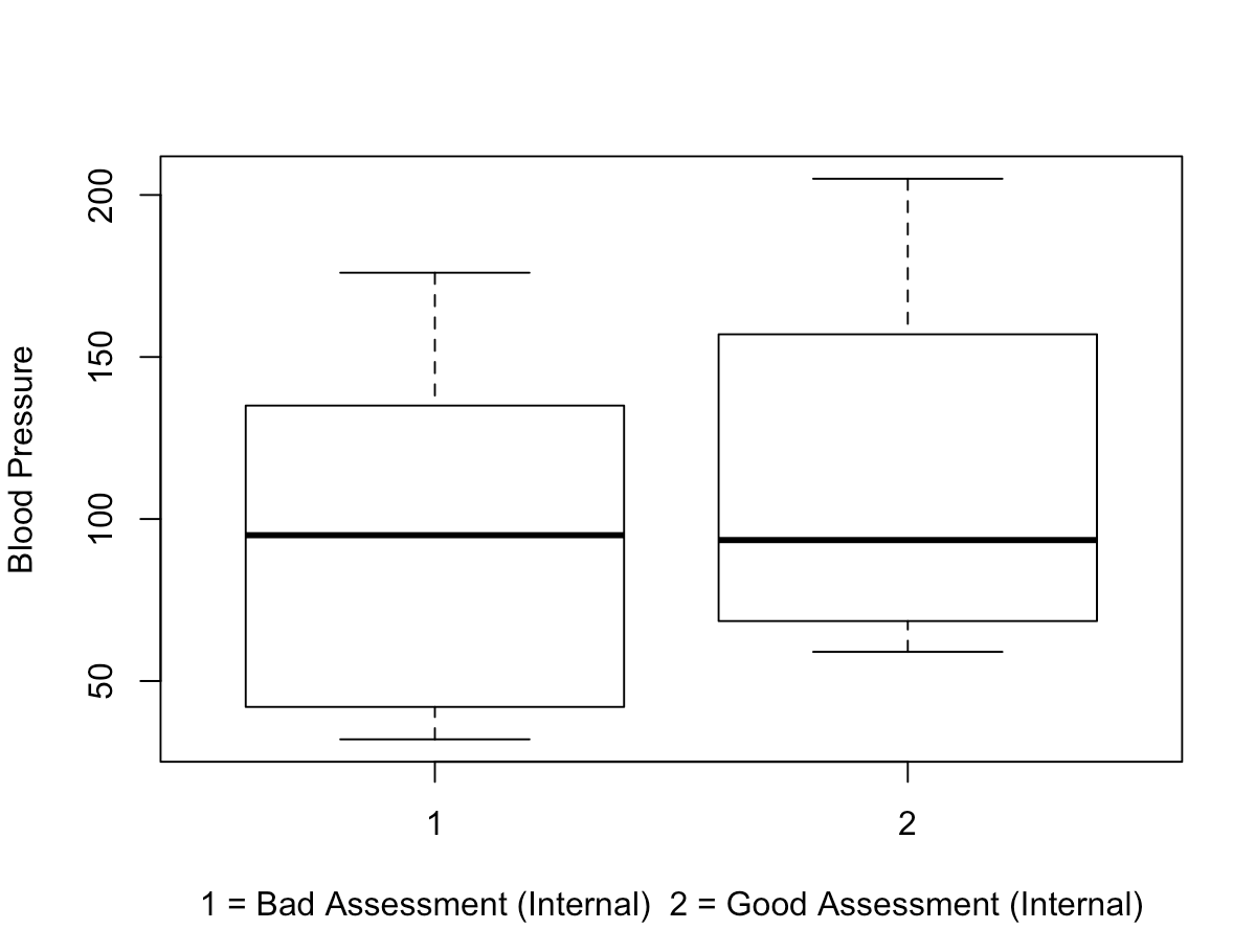
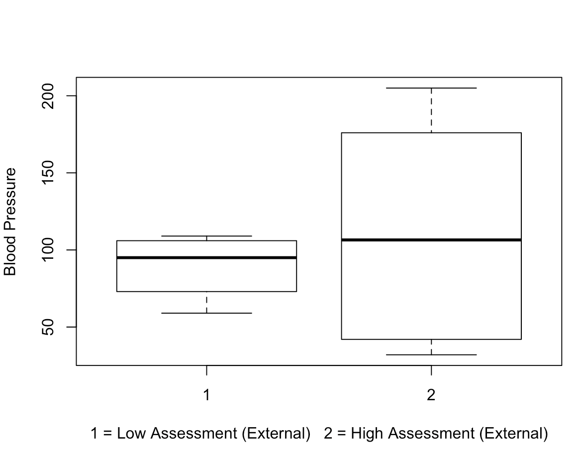
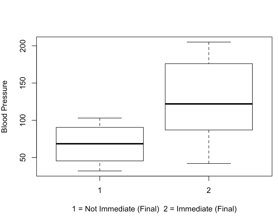
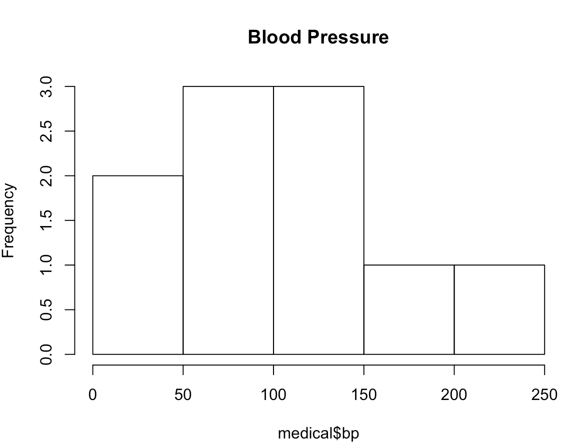
The three boxplots below represent comparisons between blood pressure and each of the MD assessments (first, second, final).
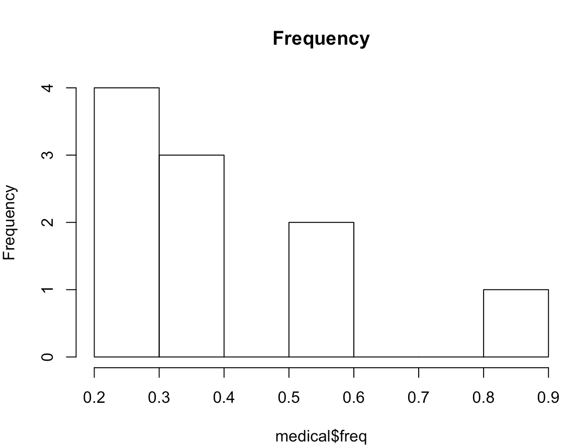
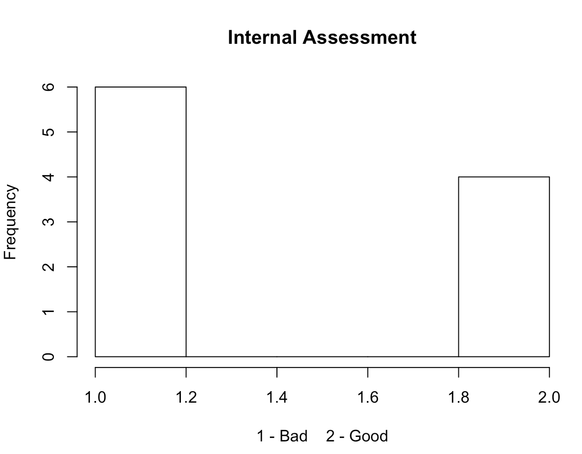
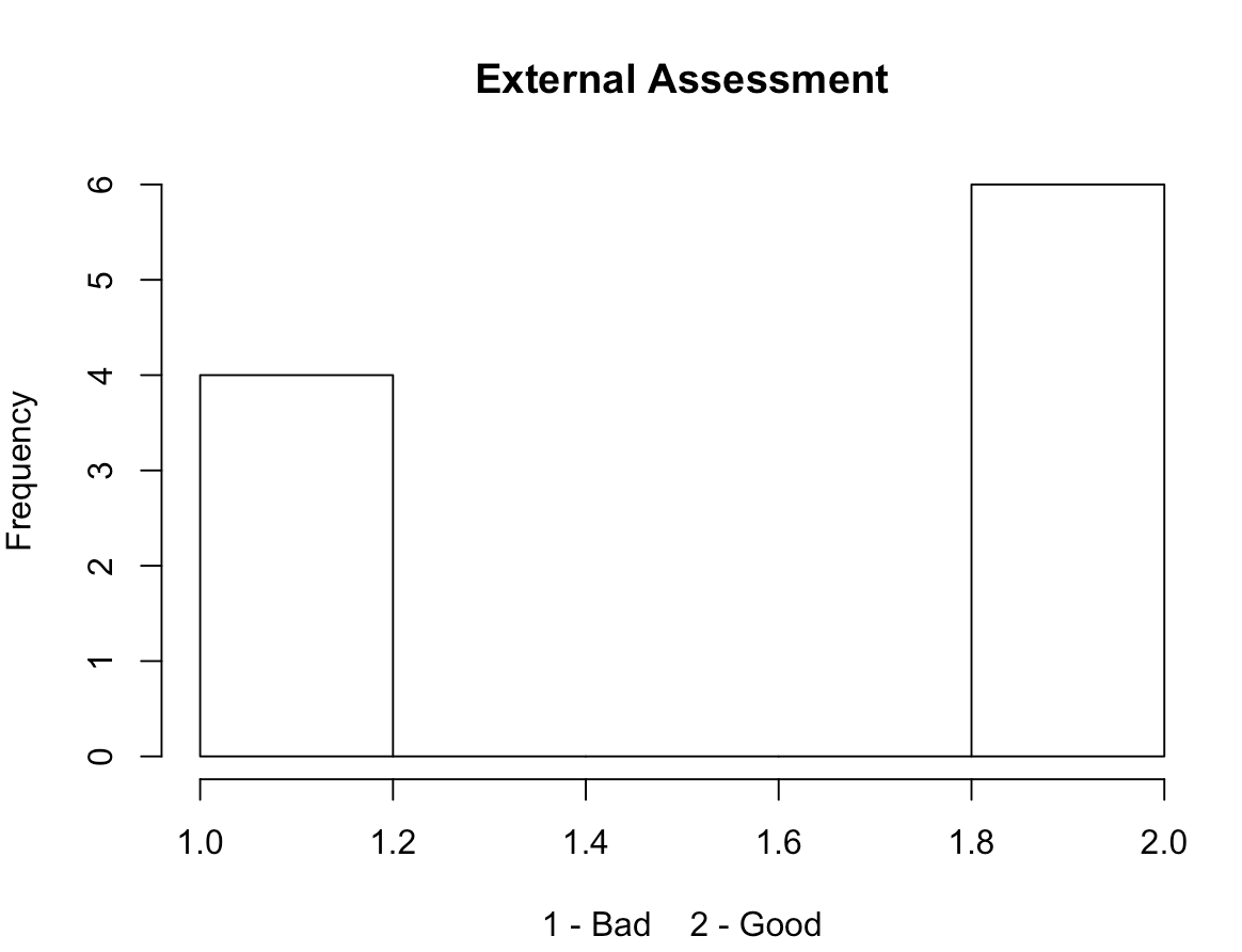
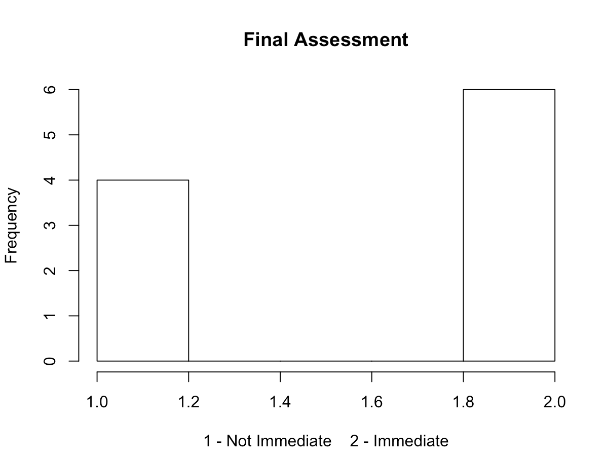
The five histograms below represent the value frequencies of:
- Doctor visitation frequency
- Blood pressure
- First visit results
- Second visit results
- Final assessment results
The two most notable potential trends I saw were that:
- The majority of participants did not visit the doctor frequently
- The majority of participants needing immediate attention have higher blood pressure